Capabilities
Strategy
Creative
Media
Social & Influencer
UX & Web Development
Analytics
Pace Brand Studios
Print Production
Work
Case Studies
Lookbook
Culture
About
People
Benefits
Careers
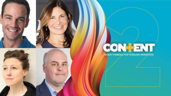
Content+
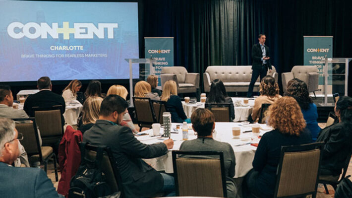
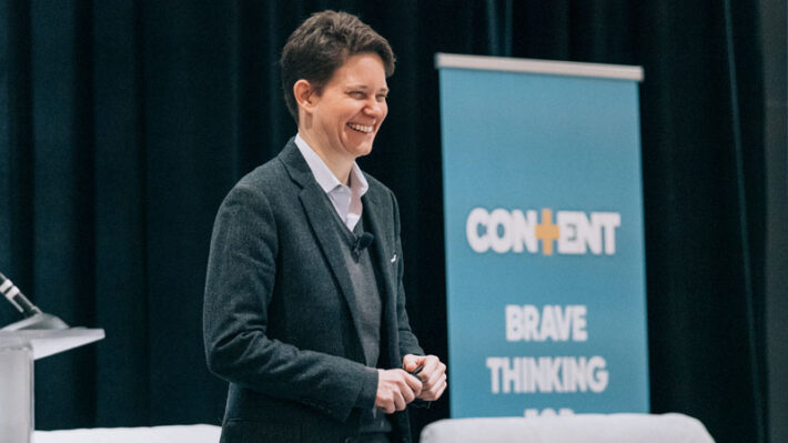
Content+ 2024 Event
Content+ Hub
Contact
Future of StoryMaking
Search icon
Search
Content+
Brave thinking for fearless leaders
All
Analytics
Design & Creative
Insights
News
Social
Strategy
White Papers
Top 8 Winning Strategies for B2B Customer Retention
The State of Audio Content 2024: Where your Brand Should Make Noise and Where it shouldn’t
Brand Loyalty: What Can Button-Up Brands Learn From the Creator Economy? (Part II)
Brand Loyalty Marketing: How to make your customers loyal to you, not just your product
The Resonance of Brand Storytelling Relies on Authenticity
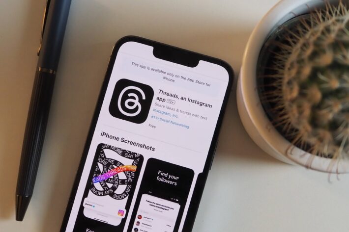
The Social Sinkhole: 5 Ways Google+ Failed Social Media (and How Threads Can Overcome Them)
5 Ways to Give Constructive Agency Feedback in 2024
Brand Identity: What Can Big Brands Learn from the Creator Economy? (Part I)
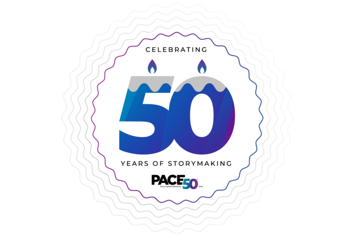
Pace, Nationally Ranked Independent Marketing Agency, Turns 50 Years Old
5 Major Marketing Disruptions—and What Pace Has Learned While Navigating Them
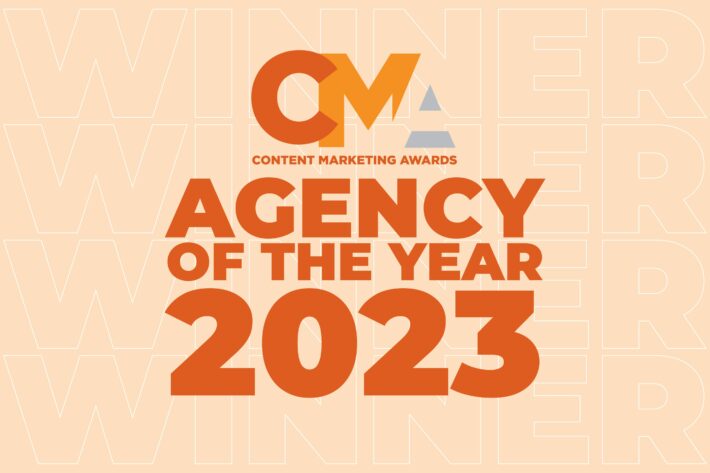
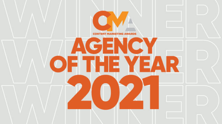
Pace Communications Wins Agency of the Year 2023 at The Content Marketing Awards
The Perfect Match: Exploring the Intersection of Content Marketing and SEO
The Power of Content Marketing: A Comprehensive Guide for Marketing Professionals
Unlocking the Power of SEO: Convincing the C-Suite With a Compelling Business Case
Brand Anniversaries: Making Marketing Moments from your Milestones
What the Rapid Rise of Threads Means for Brands on Social Media
What You Should Know About Google Analytics 4 Now That Universal Analytics is Gone
Debunking 4 Myths About Brand Blogging in 2023
More Brands Should Implement UGC Within Their Marketing Strategies in 2023
3 Things We’ve Learned From 50 Years of Storytelling Innovation
People Turn to TikTok Creators for Financial Education
Experiential Marketing in 2023
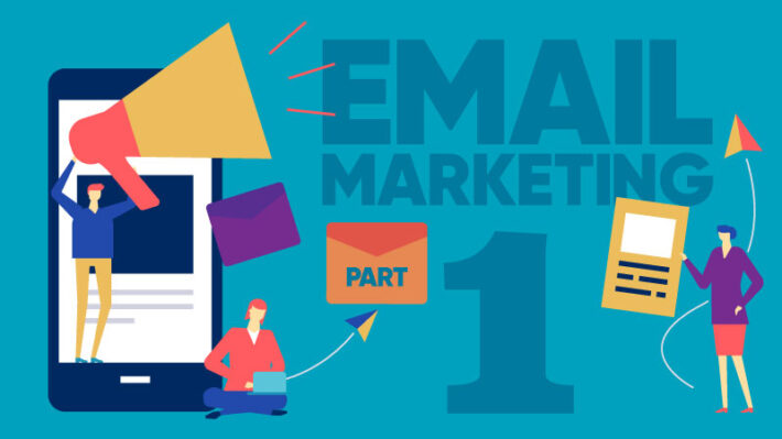
How We Surpassed Our Email Marketing Benchmarks by 2X
Influencer Marketing: What Brands Should Know Today for Success Tomorrow
Multicultural Marketing: Have You Considered a “Total Market” Approach?
4 Social Media Trends You Should Know in 2023
6 Brainstorming Techniques that Help Create Awesome Ideas
7 Trends Shaping the Future of Life Science and Pharma Marketing
How to Develop a Winning Social Media Tone of Voice Guide for Your B2B Brand
Using the Hero’s Journey to Craft Your Brand Story
Midyear Report: 2022-2023 Financial Trends for Marketers
2 Platform-Proof Principles to Level Up Your Social Media Strategy
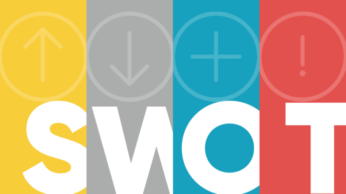
SWOT Summary: A Foolproof Way to Strategic Planning for Businesses
Real Ways to Increase Followers on Instagram and Twitter
Campaign Optimization: It’s OK Not To Be the First
Corporate Social Responsibility Reports: An Insider’s Guide
Ways to Spice Up Your ‘Boring’ Business Content
The Future of Storymaking: How Stories Persuade Us To Change Our Minds and Actions
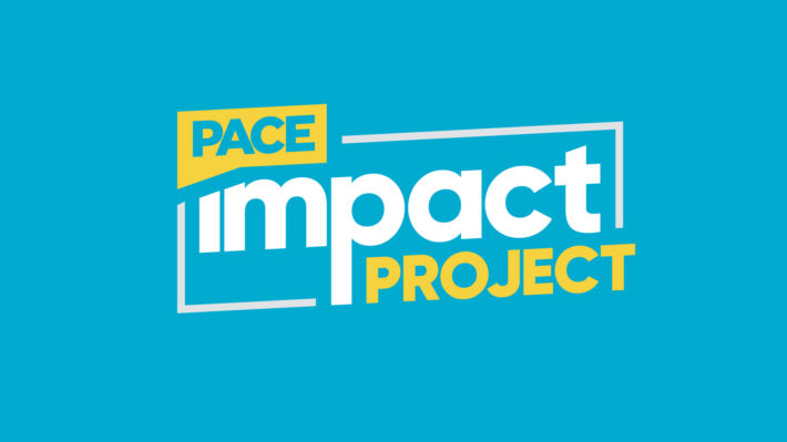
Three North Carolina Businesses Selected as Second Cohort of the Pace Impact Project
Is This Easy to Read?
5 Tips for Stellar Subject Matter Expert Interviews
7 Effective Storytelling Tricks and Tips to Win Your Audiences Over
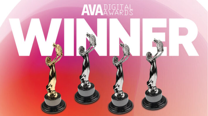
Pace Wins Four Top Creative Honors at 15th Annual International AVA Digital Awards
Content Optimization: Making Your Website Most Effective
Anatomy of a Content Optimization Strategy
Conversion Storytelling: What Is It, and Why Should You Care?
How to Create Effective Interactive Content Experiences
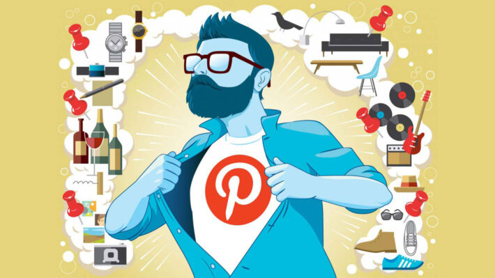
The Pinterest Resurgence and What It Means for Advertisers
Courting Your Customer: How Dating Advice Can Build Brand Affinity
Content Marketing Institute Names Pace Agency of the Year for the Third Time
Why Your Business Should Care About TikTok
Create a Branded Podcast People Want to Hear
For the Employee, With the Employee and By the Employee: How a CPG leader maximizes employee brand storytelling to recruit the best and brightest tech talent
Content+ 2021 Day 5: The Why and How of Brand Purpose
Content+ 2021 Day 4: Be Brave With Storytelling
Content+ 2021 Day 3: Connecting Elements of the Sales Journey
Content+ 2021 Day 2: When Art and Science Collide, Magic Happens
Content+ 2021 Day 1: A Practical Road Map for Inclusive Storytelling
Pace Wins at the 2021 Digiday Content Marketing Awards and the 42nd Annual Telly Awards
Facebook Marketing and iOS 14.5: What We’ve Seen So Far
North Carolina-Based Agency Wins 11 Top Honors With the 15th Annual Hermes Creative Awards
Cookiemageddon, or How I Learned to Stop Worrying and Embrace the iOS 14 Tracking Updates
Pace Recognized in 2021 Top Places to Work by Ragan Communications
Marvel’s Approach to Storytelling: What Can Brands Learn From It?
Brand Attachment: Building emotional connections across the customer journey
All Systems Are Go: Countdown to a Successful Launch With This Website Checklist
It’s Here: A New Era of Emotional, Purpose-Driven Storytelling
3 Tactics for Better Agency Collaboration
Post-COVID Mindsets: 3 Considerations for Brands in a Post-Pandemic Normal
Pace’s Digital Acceleration Model: Seven key dimensions for achieving a customer-focused digital future
Marketing Effectiveness vs. Efficiency, Part II: A 3-Step Guide for the Marketing Leader in Pursuit of Growth
She Took Failure Really Far: How a Loss Turned Into an Amazing Career in Marketing
Four Triad Businesses Selected as First Cohort of the Pace Impact Project
Marketing Effectiveness vs. Efficiency, Part I: What Is the Best Path to Growth?
Secret Skills You Didn’t Know You Needed for Your Agency Job
Where to Invest and Where to Cut Back When Budgets Are Tight
Letting Crisis Fuel Your Creativity
Making Site Interactions Count: Advanced Web Analytics
The Future of Marketing Is Data-Driven Creative
Understanding Omnichannel Campaign Performance: Solving the data usability crisis
Remote Collaboration & Feedback: How to Mentor Your Juniors
Are Your Web Analytics Too Complicated and Lacking Usability?
Women Rising: A Key Opportunity for Brand Relevance in 2020 and Beyond
Pace Wins 13 Awards in the 17th Annual MarCom Awards
Pace Impact Program Aims to Make a Difference at Home
How Our Story-Inspired Results Depend on Old-School Journalism
Our 4 Favorite Free SEO Tools
Understanding and Optimizing Page Speed
Your Crisis Marketing Toolkit
Pace’s prestigious marketing internship is recruiting for Spring 2021
The Age of Agile Content: Transforming a branded content machine into an agile content engine
How to Identify (and Remove) Spam and Bot Traffic From Google Analytics
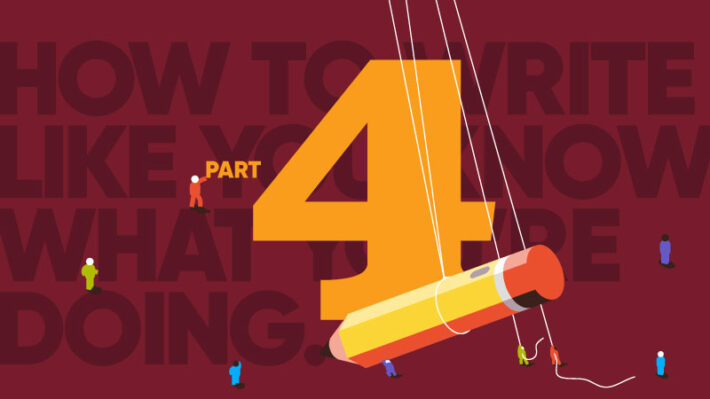
How to Write Like You Know What You’re Doing, Volume IV
Don’t Sweat the Likes: Choosing the Right Instagram Metrics for Your Business
Brand Storytelling in Times of Crisis: Three Marketing Don’ts
How to Look Good on Camera
Empathetic Marketing in Times of Crisis: Messaging Strategies to Get Through the COVID-19 Pandemic
Email Marketing Strategies: Communicating with Your Customers During Times of Uncertainty
Social Media: Your Brand’s Best Friend During the Coronavirus Pandemic
The Power of Visuals in Marketing
A Glimpse of the Paid Search Future
Looking back on (and forward to) decades of email trends: Part 1
Google Analytics KPIs: Getting the Basics Right
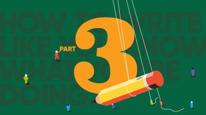
How to Write Like You Know What You’re Doing, Volume III
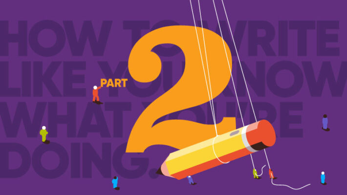
How to Write Like You Know What You’re Doing, Volume II
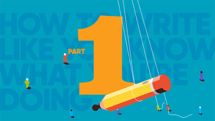
How to Write Like You Know What You’re Doing
Which Performance Metrics Matter for Your Marketing Goals
Customer Journey Maps: Setting the Path from Prospect to Customer and Beyond
What is a ‘Deepfake’ and Why it Might be Dangerous to Your Brand
Podcasting for Your Business: Top 5 Benefits
Google Ranking Factors 2019
Kid Generated Content: The New Kid on the Marketing Block
The Employee Storytelling Experience: Impacts on brand health
2020 Mid-Year Marketing Report: What we’ve learned and looking ahead
Content+: Thoughts from a Seasoned Marketer
Content+ 2019: Through a New Marketer’s Eyes
Are Your Paid Search Campaigns Receiving Voice Search Traffic?
App Store Optimization Checklist
Designing for Diversity
Podcasts: A Sound Investment for Advertisers
Mobile SEO: Why it’s More Important Than Ever
E-Commerce: Crafting a Results-Driven Content Strategy
Fast Forward to 2030: Consumers of the Future
Personalization Pioneers: 4 Ways to Increase Marketing Personalization
Table Stakes: What I Learned at the Skift Table Conference
Interactive Ebook vs. Static Ebook – Which One Makes Sense for Your Audience?
How to Use Google Analytics to Track a User’s Original Traffic Source
Google Analytics KPIs: Get the most out of your visitors’ interaction with your webpages
Youth Rising: Meet Gen Z, the Next Big Consumer Group
Email Personalization: Reach the Audience, Not Just the Inbox
5 Ways to Entice Tomorrow’s Consumer
Creativity and Technology Are No Longer Separate
The Rise of Voice Search and Best Practices to Optimize Your Voice Search SEO
Smart Data: The Building Blocks for Smart Brands
Master Brand Storytelling: What Your Customers Are Craving
The Human’s Guide to Blockchain
Universal Truths: The Key to Great Work
How Much Content Does Your Audience Need? A B2B Case Study
Five Tips to Dramatically Increase the ROI of Your Video Marketing Strategy
Shoes That Order Pizza: Physical & Digital Integration
A Brand to Remember: The Message That Rises Above the Rest
Six Ways to Find Creative Inspiration (When You’re Just Not Feeling It)
Why You Need a Content Strategy to Achieve Brand Success
Wearable Design: Why Thinking Small Is Really the Big Idea
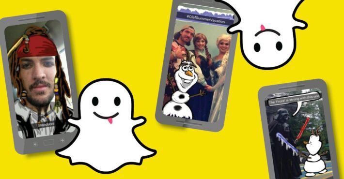
What Marketers Can Learn From the Evolution of Snap, Inc.
A New Approach to the Average Time on Page in Google Analytics
Micro-Video Content: Telling a Brand Story in 10 Seconds or Less
How to Maximize Your Content Investment Through Email Marketing
Nine Email Tests to Boost Engagement in 2017
Why Your Content Needs an Integrated Customer-Centric Approach
Using Fashion and Technology to Create Unique Customer Experiences
What’s Next and What’s Not: Internet of Things
Evaluating Success: Key Performance Questions to Ask Yourself
Tim Ferriss Reveals His Secrets to Great Storytelling
Where Fiction and Content Marketing Meet: Creative Personas
Determining Success: The Value in Conducting a Content Audit
Learning to “See” Content Marketing Differently at the Weatherspoon Art Museum
A New Perspective: What Brands Can Learn From Politicians
Meditation Could Be Your Secret Weapon Against Creative Slumps
Optimize Your Site’s Content Experience with Segmentation and Personalization
Beauty Buffs and Fashionistas Take on Monthly Subscription Boxes
The Science of Storytelling
The Creative Process: Letting Inspiration Lead the Way
21 Automated Email Campaign Ideas to Boost Loyalty, Engagement and Sales
How to Establish a Framework for Measuring the ROI of a Content Marketing Program
The Hard Part of Marketing: (Truly) Putting the Audience First
Estée Lauder’s Bottom-up Beauty
How Top Brands Use Snapchat to Share Their Story
The Jack Kerouac School of Content Marketing
How to Use UTM Tagging in Google Analytics
Your Complete Guide to UX with Free UX Checklist Download
Beyond the Written Word: Enrich Your Storytelling with Multimedia Content
How to Optimize Your Site for Local SEO
Augmented Reality: Altering the Future of Marketing
Make Content Great Again: How to Repurpose Content
Drinks with Creatives: The Sundance Edition
Picturing Change: The Power of Visual Storytelling and Content
Successful Movie Marketing Strategies and Why They Worked
Tips for Working With Influencers — From an Influencer
Emerging Technology: What’s Next for Marketers?
How One B2B Brand Sucked Me in With Gamification
Top SEO Mistakes: What NOT to Do in the New Year
What’s Next and What’s Not: Analytics & Search
What Millennials Really Think About Influencers
GE: Building a Science Nerd Army Through Social
Coke on Creating Brand Love Through Storytelling
What’s Next and What’s Not: Digital Strategy
Who’s Getting Virtual Reality Right?
48 Sites in 48 Hours for 48 Nonprofits: Collaboration for a Cause
Putting IKEA’s Digital Strategy Together (With No Leftover Pieces)
Cynics Compare the Content on Wearable Watches
Why Brands Should Go Big on Programmatic Ads
In-Store Beacons: Where Cool Outweighs Creepy
How Car Brands Look to the Past to Create Powerful Content
How Netflix is Winning at Content Marketing
3 Ways Brands Can Use Snapchat to Reach Their Target Audience
Millennials: Believe It or Not, They’re Human, Too
2015 Content Marketing Analytics Trends and Predictions for 2016
How to Use Google Analytics Advanced Segments
What’s the Difference? Comparing Google Analytics and Adobe SiteCatalyst
Live Event Marketing: This Brand Did It Right
7 Important Interactive Design Trends for Any Year
Authenticity. Patagonia’s Timely Truth.
3 Reasons to be Proud of Your Journalism Degree
2015 Top 3 Creative Trends
Your Team’s Creative Passions Could Be Your Competitive Edge
Design Thinking is the New Black
Evergreen Content: What I Learned From Reality TV
Working Moms: Why She Still Reigns in Retail
Cannes Creativity Festival Recap: The Internet of Things
Decisions, Decisions, Decisions: Microsite vs Subdirectory vs Subdomain
3 Lessons from Shark Tank: How to Present Your Big Idea to a Client
Suits vs Creatives: The Struggle Is Real. The Problems Are Not.
Managing Millennials: Advice from a Professor
Buy It Like You Mean It: Millennial Shopping Behavior
Ford, Fiat and Honda: An Automotive Content Marketing Test Drive
Shop Your Age: Does Your Content Target by Generation?
Was Margaret Atwood Really a Content Marketer?
MotorWeek Shows That a Good Story Never Dies
Powerful Practices that Take Content from Good to Great
Forget the Dad Bod, Meet the Pinterest Bod
How to Engage Millennials With New Video Technology
Ketna Patel’s Key to Unlocking Creative Ideas
Five Practical Ways to Use Social Listening to Inform Your Content Marketing Plan
Less Noise, More Voice: How to Get People to Pay Attention to Your Brand on Social Media
Snapchatting for Brands: Tips for Creating and Posting Content like the Snapchat Pros
Meeting Content Needs in a Highly Regulated Industry
Does Correct Grammar Influence Brand Marketing Success?
Brands Play Well with Gamification
Content Marketing Programs – Making Your Seat at the Big Table Work (Part 2)
Content Marketing Programs – Time for a Seat at the Big Table (Part 1)
How Luxury Fashion Brands Use Social Media
Unlocking the Power of SEO: Convincing the C-Suite With a Compelling Business Case
What the Rapid Rise of Threads Means for Brands on Social Media
What You Should Know About Google Analytics 4 Now That Universal Analytics is Gone
How We Surpassed Our Email Marketing Benchmarks by 2X
Facebook Marketing and iOS 14.5: What We’ve Seen So Far
Cookiemageddon, or How I Learned to Stop Worrying and Embrace the iOS 14 Tracking Updates
Marketing Effectiveness vs. Efficiency, Part II: A 3-Step Guide for the Marketing Leader in Pursuit of Growth
Marketing Effectiveness vs. Efficiency, Part I: What Is the Best Path to Growth?
Making Site Interactions Count: Advanced Web Analytics
The Future of Marketing Is Data-Driven Creative
Are Your Web Analytics Too Complicated and Lacking Usability?
Our 4 Favorite Free SEO Tools
Understanding and Optimizing Page Speed
How to Identify (and Remove) Spam and Bot Traffic From Google Analytics
Google Analytics KPIs: Getting the Basics Right
Which Performance Metrics Matter for Your Marketing Goals
How to Use Google Analytics to Track a User’s Original Traffic Source
Google Analytics KPIs: Get the most out of your visitors’ interaction with your webpages
Smart Data: The Building Blocks for Smart Brands
A New Approach to the Average Time on Page in Google Analytics
Why Your Content Needs an Integrated Customer-Centric Approach
Evaluating Success: Key Performance Questions to Ask Yourself
Determining Success: The Value in Conducting a Content Audit
How to Establish a Framework for Measuring the ROI of a Content Marketing Program
How to Use UTM Tagging in Google Analytics
Why Brands Should Go Big on Programmatic Ads
2015 Content Marketing Analytics Trends and Predictions for 2016
How to Use Google Analytics Advanced Segments
What’s the Difference? Comparing Google Analytics and Adobe SiteCatalyst
The Resonance of Brand Storytelling Relies on Authenticity
5 Major Marketing Disruptions—and What Pace Has Learned While Navigating Them
The Power of Content Marketing: A Comprehensive Guide for Marketing Professionals
How to Create Effective Interactive Content Experiences
All Systems Are Go: Countdown to a Successful Launch With This Website Checklist
She Took Failure Really Far: How a Loss Turned Into an Amazing Career in Marketing
Secret Skills You Didn’t Know You Needed for Your Agency Job
Letting Crisis Fuel Your Creativity
Women Rising: A Key Opportunity for Brand Relevance in 2020 and Beyond
How to Look Good on Camera
The Power of Visuals in Marketing
Looking back on (and forward to) decades of email trends: Part 1
Content+: Thoughts from a Seasoned Marketer
Content+ 2019: Through a New Marketer’s Eyes
Designing for Diversity
Personalization Pioneers: 4 Ways to Increase Marketing Personalization
Table Stakes: What I Learned at the Skift Table Conference
Interactive Ebook vs. Static Ebook – Which One Makes Sense for Your Audience?
Creativity and Technology Are No Longer Separate
Universal Truths: The Key to Great Work
Shoes That Order Pizza: Physical & Digital Integration
Six Ways to Find Creative Inspiration (When You’re Just Not Feeling It)
Wearable Design: Why Thinking Small Is Really the Big Idea
Tim Ferriss Reveals His Secrets to Great Storytelling
Where Fiction and Content Marketing Meet: Creative Personas
Learning to “See” Content Marketing Differently at the Weatherspoon Art Museum
Meditation Could Be Your Secret Weapon Against Creative Slumps
Optimize Your Site’s Content Experience with Segmentation and Personalization
Emerging Technology: What’s Next for Marketers?
Why Brands Should Go Big on Programmatic Ads
7 Important Interactive Design Trends for Any Year
Authenticity. Patagonia’s Timely Truth.
3 Reasons to be Proud of Your Journalism Degree
2015 Top 3 Creative Trends
Your Team’s Creative Passions Could Be Your Competitive Edge
Design Thinking is the New Black
Evergreen Content: What I Learned From Reality TV
Cannes Creativity Festival Recap: The Internet of Things
Decisions, Decisions, Decisions: Microsite vs Subdirectory vs Subdomain
Ford, Fiat and Honda: An Automotive Content Marketing Test Drive
Was Margaret Atwood Really a Content Marketer?
MotorWeek Shows That a Good Story Never Dies
Powerful Practices that Take Content from Good to Great
The State of Audio Content 2024: Where your Brand Should Make Noise and Where it shouldn’t
Brand Loyalty: What Can Button-Up Brands Learn From the Creator Economy? (Part II)
Brand Loyalty Marketing: How to make your customers loyal to you, not just your product
5 Ways to Give Constructive Agency Feedback in 2024
Unlocking the Power of SEO: Convincing the C-Suite With a Compelling Business Case
What the Rapid Rise of Threads Means for Brands on Social Media
What You Should Know About Google Analytics 4 Now That Universal Analytics is Gone
Debunking 4 Myths About Brand Blogging in 2023
More Brands Should Implement UGC Within Their Marketing Strategies in 2023
3 Things We’ve Learned From 50 Years of Storytelling Innovation
People Turn to TikTok Creators for Financial Education
Experiential Marketing in 2023
How We Surpassed Our Email Marketing Benchmarks by 2X
Influencer Marketing: What Brands Should Know Today for Success Tomorrow
Multicultural Marketing: Have You Considered a “Total Market” Approach?
6 Brainstorming Techniques that Help Create Awesome Ideas
How to Develop a Winning Social Media Tone of Voice Guide for Your B2B Brand
Using the Hero’s Journey to Craft Your Brand Story
2 Platform-Proof Principles to Level Up Your Social Media Strategy
SWOT Summary: A Foolproof Way to Strategic Planning for Businesses
Real Ways to Increase Followers on Instagram and Twitter
Campaign Optimization: It’s OK Not To Be the First
Corporate Social Responsibility Reports: An Insider’s Guide
Ways to Spice Up Your ‘Boring’ Business Content
The Future of Storymaking: How Stories Persuade Us To Change Our Minds and Actions
Is This Easy to Read?
5 Tips for Stellar Subject Matter Expert Interviews
7 Effective Storytelling Tricks and Tips to Win Your Audiences Over
Content Optimization: Making Your Website Most Effective
How to Create Effective Interactive Content Experiences
The Pinterest Resurgence and What It Means for Advertisers
Courting Your Customer: How Dating Advice Can Build Brand Affinity
Why Your Business Should Care About TikTok
Create a Branded Podcast People Want to Hear
Content+ 2021 Day 5: The Why and How of Brand Purpose
Content+ 2021 Day 4: Be Brave With Storytelling
Content+ 2021 Day 3: Connecting Elements of the Sales Journey
Content+ 2021 Day 2: When Art and Science Collide, Magic Happens
Content+ 2021 Day 1: A Practical Road Map for Inclusive Storytelling
Facebook Marketing and iOS 14.5: What We’ve Seen So Far
Marvel’s Approach to Storytelling: What Can Brands Learn From It?
All Systems Are Go: Countdown to a Successful Launch With This Website Checklist
3 Tactics for Better Agency Collaboration
Post-COVID Mindsets: 3 Considerations for Brands in a Post-Pandemic Normal
She Took Failure Really Far: How a Loss Turned Into an Amazing Career in Marketing
Secret Skills You Didn’t Know You Needed for Your Agency Job
Where to Invest and Where to Cut Back When Budgets Are Tight
Making Site Interactions Count: Advanced Web Analytics
The Future of Marketing Is Data-Driven Creative
Remote Collaboration & Feedback: How to Mentor Your Juniors
Are Your Web Analytics Too Complicated and Lacking Usability?
Women Rising: A Key Opportunity for Brand Relevance in 2020 and Beyond
How Our Story-Inspired Results Depend on Old-School Journalism
Our 4 Favorite Free SEO Tools
Understanding and Optimizing Page Speed
Your Crisis Marketing Toolkit
How to Identify (and Remove) Spam and Bot Traffic From Google Analytics
How to Write Like You Know What You’re Doing, Volume IV
Don’t Sweat the Likes: Choosing the Right Instagram Metrics for Your Business
Brand Storytelling in Times of Crisis: Three Marketing Don’ts
How to Look Good on Camera
Email Marketing Strategies: Communicating with Your Customers During Times of Uncertainty
Social Media: Your Brand’s Best Friend During the Coronavirus Pandemic
The Power of Visuals in Marketing
A Glimpse of the Paid Search Future
Looking back on (and forward to) decades of email trends: Part 1
Google Analytics KPIs: Getting the Basics Right
How to Write Like You Know What You’re Doing, Volume III
How to Write Like You Know What You’re Doing, Volume II
How to Write Like You Know What You’re Doing
Which Performance Metrics Matter for Your Marketing Goals
Customer Journey Maps: Setting the Path from Prospect to Customer and Beyond
What is a ‘Deepfake’ and Why it Might be Dangerous to Your Brand
Podcasting for Your Business: Top 5 Benefits
Google Ranking Factors 2019
Kid Generated Content: The New Kid on the Marketing Block
Are Your Paid Search Campaigns Receiving Voice Search Traffic?
App Store Optimization Checklist
Designing for Diversity
Podcasts: A Sound Investment for Advertisers
Mobile SEO: Why it’s More Important Than Ever
E-Commerce: Crafting a Results-Driven Content Strategy
Fast Forward to 2030: Consumers of the Future
Personalization Pioneers: 4 Ways to Increase Marketing Personalization
Interactive Ebook vs. Static Ebook – Which One Makes Sense for Your Audience?
How to Use Google Analytics to Track a User’s Original Traffic Source
Google Analytics KPIs: Get the most out of your visitors’ interaction with your webpages
Youth Rising: Meet Gen Z, the Next Big Consumer Group
Email Personalization: Reach the Audience, Not Just the Inbox
5 Ways to Entice Tomorrow’s Consumer
The Rise of Voice Search and Best Practices to Optimize Your Voice Search SEO
Master Brand Storytelling: What Your Customers Are Craving
The Human’s Guide to Blockchain
How Much Content Does Your Audience Need? A B2B Case Study
Five Tips to Dramatically Increase the ROI of Your Video Marketing Strategy
A Brand to Remember: The Message That Rises Above the Rest
Six Ways to Find Creative Inspiration (When You’re Just Not Feeling It)
Why You Need a Content Strategy to Achieve Brand Success
Wearable Design: Why Thinking Small Is Really the Big Idea
A New Approach to the Average Time on Page in Google Analytics
Micro-Video Content: Telling a Brand Story in 10 Seconds or Less
How to Maximize Your Content Investment Through Email Marketing
Nine Email Tests to Boost Engagement in 2017
Why Your Content Needs an Integrated Customer-Centric Approach
Using Fashion and Technology to Create Unique Customer Experiences
Evaluating Success: Key Performance Questions to Ask Yourself
Determining Success: The Value in Conducting a Content Audit
Optimize Your Site’s Content Experience with Segmentation and Personalization
The Science of Storytelling
21 Automated Email Campaign Ideas to Boost Loyalty, Engagement and Sales
How to Establish a Framework for Measuring the ROI of a Content Marketing Program
The Hard Part of Marketing: (Truly) Putting the Audience First
How Top Brands Use Snapchat to Share Their Story
How to Use UTM Tagging in Google Analytics
Your Complete Guide to UX with Free UX Checklist Download
Beyond the Written Word: Enrich Your Storytelling with Multimedia Content
How to Optimize Your Site for Local SEO
Make Content Great Again: How to Repurpose Content
Successful Movie Marketing Strategies and Why They Worked
Tips for Working With Influencers — From an Influencer
Emerging Technology: What’s Next for Marketers?
How One B2B Brand Sucked Me in With Gamification
Top SEO Mistakes: What NOT to Do in the New Year
How Car Brands Look to the Past to Create Powerful Content
How Netflix is Winning at Content Marketing
3 Ways Brands Can Use Snapchat to Reach Their Target Audience
Millennials: Believe It or Not, They’re Human, Too
2015 Content Marketing Analytics Trends and Predictions for 2016
How to Use Google Analytics Advanced Segments
What’s the Difference? Comparing Google Analytics and Adobe SiteCatalyst
Live Event Marketing: This Brand Did It Right
Decisions, Decisions, Decisions: Microsite vs Subdirectory vs Subdomain
3 Lessons from Shark Tank: How to Present Your Big Idea to a Client
Suits vs Creatives: The Struggle Is Real. The Problems Are Not.
Five Practical Ways to Use Social Listening to Inform Your Content Marketing Plan
Less Noise, More Voice: How to Get People to Pay Attention to Your Brand on Social Media
Snapchatting for Brands: Tips for Creating and Posting Content like the Snapchat Pros
Meeting Content Needs in a Highly Regulated Industry
Does Correct Grammar Influence Brand Marketing Success?
Brands Play Well with Gamification
Content Marketing Programs – Making Your Seat at the Big Table Work (Part 2)
Content Marketing Programs – Time for a Seat at the Big Table (Part 1)
How Luxury Fashion Brands Use Social Media
Pace, Nationally Ranked Independent Marketing Agency, Turns 50 Years Old
Pace Communications Wins Agency of the Year 2023 at The Content Marketing Awards
Three North Carolina Businesses Selected as Second Cohort of the Pace Impact Project
Pace Wins Four Top Creative Honors at 15th Annual International AVA Digital Awards
Content Marketing Institute Names Pace Agency of the Year for the Third Time
Pace Wins at the 2021 Digiday Content Marketing Awards and the 42nd Annual Telly Awards
North Carolina-Based Agency Wins 11 Top Honors With the 15th Annual Hermes Creative Awards
Pace Recognized in 2021 Top Places to Work by Ragan Communications
Four Triad Businesses Selected as First Cohort of the Pace Impact Project
Pace Wins 13 Awards in the 17th Annual MarCom Awards
Pace Impact Program Aims to Make a Difference at Home
Pace’s prestigious marketing internship is recruiting for Spring 2021
The Social Sinkhole: 5 Ways Google+ Failed Social Media (and How Threads Can Overcome Them)
What the Rapid Rise of Threads Means for Brands on Social Media
More Brands Should Implement UGC Within Their Marketing Strategies in 2023
People Turn to TikTok Creators for Financial Education
Influencer Marketing: What Brands Should Know Today for Success Tomorrow
4 Social Media Trends You Should Know in 2023
How to Develop a Winning Social Media Tone of Voice Guide for Your B2B Brand
2 Platform-Proof Principles to Level Up Your Social Media Strategy
Real Ways to Increase Followers on Instagram and Twitter
The Pinterest Resurgence and What It Means for Advertisers
Why Your Business Should Care About TikTok
Facebook Marketing and iOS 14.5: What We’ve Seen So Far
Don’t Sweat the Likes: Choosing the Right Instagram Metrics for Your Business
Social Media: Your Brand’s Best Friend During the Coronavirus Pandemic
Are Your Paid Search Campaigns Receiving Voice Search Traffic?
What Marketers Can Learn From the Evolution of Snap, Inc.
Micro-Video Content: Telling a Brand Story in 10 Seconds or Less
How Top Brands Use Snapchat to Share Their Story
Tips for Working With Influencers — From an Influencer
3 Ways Brands Can Use Snapchat to Reach Their Target Audience
Five Practical Ways to Use Social Listening to Inform Your Content Marketing Plan
Less Noise, More Voice: How to Get People to Pay Attention to Your Brand on Social Media
Snapchatting for Brands: Tips for Creating and Posting Content like the Snapchat Pros
How Luxury Fashion Brands Use Social Media
Top 8 Winning Strategies for B2B Customer Retention
Brand Loyalty Marketing: How to make your customers loyal to you, not just your product
5 Ways to Give Constructive Agency Feedback in 2024
Brand Identity: What Can Big Brands Learn from the Creator Economy? (Part I)
The Perfect Match: Exploring the Intersection of Content Marketing and SEO
Brand Anniversaries: Making Marketing Moments from your Milestones
Debunking 4 Myths About Brand Blogging in 2023
More Brands Should Implement UGC Within Their Marketing Strategies in 2023
3 Things We’ve Learned From 50 Years of Storytelling Innovation
Experiential Marketing in 2023
How We Surpassed Our Email Marketing Benchmarks by 2X
Influencer Marketing: What Brands Should Know Today for Success Tomorrow
Multicultural Marketing: Have You Considered a “Total Market” Approach?
6 Brainstorming Techniques that Help Create Awesome Ideas
Using the Hero’s Journey to Craft Your Brand Story
SWOT Summary: A Foolproof Way to Strategic Planning for Businesses
Campaign Optimization: It’s OK Not To Be the First
7 Effective Storytelling Tricks and Tips to Win Your Audiences Over
Conversion Storytelling: What Is It, and Why Should You Care?
Courting Your Customer: How Dating Advice Can Build Brand Affinity
Create a Branded Podcast People Want to Hear
Content+ 2021 Day 5: The Why and How of Brand Purpose
Content+ 2021 Day 4: Be Brave With Storytelling
Content+ 2021 Day 3: Connecting Elements of the Sales Journey
Content+ 2021 Day 2: When Art and Science Collide, Magic Happens
Content+ 2021 Day 1: A Practical Road Map for Inclusive Storytelling
Marvel’s Approach to Storytelling: What Can Brands Learn From It?
It’s Here: A New Era of Emotional, Purpose-Driven Storytelling
3 Tactics for Better Agency Collaboration
Post-COVID Mindsets: 3 Considerations for Brands in a Post-Pandemic Normal
Marketing Effectiveness vs. Efficiency, Part II: A 3-Step Guide for the Marketing Leader in Pursuit of Growth
Marketing Effectiveness vs. Efficiency, Part I: What Is the Best Path to Growth?
Where to Invest and Where to Cut Back When Budgets Are Tight
How Our Story-Inspired Results Depend on Old-School Journalism
Our 4 Favorite Free SEO Tools
Understanding and Optimizing Page Speed
Your Crisis Marketing Toolkit
How to Write Like You Know What You’re Doing, Volume IV
Brand Storytelling in Times of Crisis: Three Marketing Don’ts
Empathetic Marketing in Times of Crisis: Messaging Strategies to Get Through the COVID-19 Pandemic
Email Marketing Strategies: Communicating with Your Customers During Times of Uncertainty
A Glimpse of the Paid Search Future
How to Write Like You Know What You’re Doing, Volume III
How to Write Like You Know What You’re Doing, Volume II
How to Write Like You Know What You’re Doing
Customer Journey Maps: Setting the Path from Prospect to Customer and Beyond
Podcasting for Your Business: Top 5 Benefits
Google Ranking Factors 2019
Kid Generated Content: The New Kid on the Marketing Block
Content+: Thoughts from a Seasoned Marketer
Content+ 2019: Through a New Marketer’s Eyes
App Store Optimization Checklist
Podcasts: A Sound Investment for Advertisers
Mobile SEO: Why it’s More Important Than Ever
Fast Forward to 2030: Consumers of the Future
Youth Rising: Meet Gen Z, the Next Big Consumer Group
Email Personalization: Reach the Audience, Not Just the Inbox
5 Ways to Entice Tomorrow’s Consumer
Creativity and Technology Are No Longer Separate
The Rise of Voice Search and Best Practices to Optimize Your Voice Search SEO
Smart Data: The Building Blocks for Smart Brands
Master Brand Storytelling: What Your Customers Are Craving
The Human’s Guide to Blockchain
How Much Content Does Your Audience Need? A B2B Case Study
Five Tips to Dramatically Increase the ROI of Your Video Marketing Strategy
A Brand to Remember: The Message That Rises Above the Rest
Why You Need a Content Strategy to Achieve Brand Success
How to Maximize Your Content Investment Through Email Marketing
Nine Email Tests to Boost Engagement in 2017
Using Fashion and Technology to Create Unique Customer Experiences
What’s Next and What’s Not: Internet of Things
Tim Ferriss Reveals His Secrets to Great Storytelling
A New Perspective: What Brands Can Learn From Politicians
The Science of Storytelling
21 Automated Email Campaign Ideas to Boost Loyalty, Engagement and Sales
The Hard Part of Marketing: (Truly) Putting the Audience First
Your Complete Guide to UX with Free UX Checklist Download
Beyond the Written Word: Enrich Your Storytelling with Multimedia Content
How to Optimize Your Site for Local SEO
Make Content Great Again: How to Repurpose Content
Successful Movie Marketing Strategies and Why They Worked
How One B2B Brand Sucked Me in With Gamification
Top SEO Mistakes: What NOT to Do in the New Year
Why Brands Should Go Big on Programmatic Ads
In-Store Beacons: Where Cool Outweighs Creepy
How Car Brands Look to the Past to Create Powerful Content
How Netflix is Winning at Content Marketing
Millennials: Believe It or Not, They’re Human, Too
Live Event Marketing: This Brand Did It Right
Authenticity. Patagonia’s Timely Truth.
Evergreen Content: What I Learned From Reality TV
Working Moms: Why She Still Reigns in Retail
3 Lessons from Shark Tank: How to Present Your Big Idea to a Client
Suits vs Creatives: The Struggle Is Real. The Problems Are Not.
Managing Millennials: Advice from a Professor
Buy It Like You Mean It: Millennial Shopping Behavior
Shop Your Age: Does Your Content Target by Generation?
MotorWeek Shows That a Good Story Never Dies
Powerful Practices that Take Content from Good to Great
Meeting Content Needs in a Highly Regulated Industry
Does Correct Grammar Influence Brand Marketing Success?
Brands Play Well with Gamification
Content Marketing Programs – Making Your Seat at the Big Table Work (Part 2)
Content Marketing Programs – Time for a Seat at the Big Table (Part 1)
7 Trends Shaping the Future of Life Science and Pharma Marketing
Midyear Report: 2022-2023 Financial Trends for Marketers
Anatomy of a Content Optimization Strategy
For the Employee, With the Employee and By the Employee: How a CPG leader maximizes employee brand storytelling to recruit the best and brightest tech talent
Brand Attachment: Building emotional connections across the customer journey
Pace’s Digital Acceleration Model: Seven key dimensions for achieving a customer-focused digital future
Understanding Omnichannel Campaign Performance: Solving the data usability crisis
The Age of Agile Content: Transforming a branded content machine into an agile content engine
The Employee Storytelling Experience: Impacts on brand health
2020 Mid-Year Marketing Report: What we’ve learned and looking ahead
Subscribe to PACE Insights


The Social Sinkhole: 5 Ways Google+ Failed Social Media (and How Threads Can Overcome Them)
What the Rapid Rise of Threads Means for Brands on Social Media
More Brands Should Implement UGC Within Their Marketing Strategies in 2023
People Turn to TikTok Creators for Financial Education
Influencer Marketing: What Brands Should Know Today for Success Tomorrow
4 Social Media Trends You Should Know in 2023
How to Develop a Winning Social Media Tone of Voice Guide for Your B2B Brand
2 Platform-Proof Principles to Level Up Your Social Media Strategy
Real Ways to Increase Followers on Instagram and Twitter
The Pinterest Resurgence and What It Means for Advertisers
Why Your Business Should Care About TikTok
Facebook Marketing and iOS 14.5: What We’ve Seen So Far
Don’t Sweat the Likes: Choosing the Right Instagram Metrics for Your Business
Social Media: Your Brand’s Best Friend During the Coronavirus Pandemic
Are Your Paid Search Campaigns Receiving Voice Search Traffic?
What Marketers Can Learn From the Evolution of Snap, Inc.
Micro-Video Content: Telling a Brand Story in 10 Seconds or Less
How Top Brands Use Snapchat to Share Their Story
Tips for Working With Influencers — From an Influencer
3 Ways Brands Can Use Snapchat to Reach Their Target Audience
Five Practical Ways to Use Social Listening to Inform Your Content Marketing Plan
Less Noise, More Voice: How to Get People to Pay Attention to Your Brand on Social Media
Snapchatting for Brands: Tips for Creating and Posting Content like the Snapchat Pros
How Luxury Fashion Brands Use Social Media