Which design trends are capturing the spotlight today?
As the dust settled on the interactive battlefield, a handful of trends emerged victorious. While many trends are one-time victors — trends whose time in the spotlight is brief and fleeting — there are a handful of crucially important trends you need to be aware of this year.
Mobile First Responsive Design
This first trend is not new or revelatory. It is, what I would consider, the most important trend on this list. In some ways it is the reason that many of the other trends became trends in the first place.
As I stated earlier, mobile first responsive design is not a new trend. The ability to create a website that has one code base and works perfectly across a spectrum of devices is critical for the modern web audience. We are rapidly approaching the point where the mobile audience will overtake the desktop audience. With that being said, designing for mobile needs to be the top priority if it hasn’t been already.
Flat Design
As a trend, flat design has been gaining momentum over the last two years. This is in no small part due to the release of Apple’s iOS 7 and 8, Windows Metro UI, and Google’s Material Design — each (to various degrees) feature flat design. Since their release, and flat design’s rise in popularity, the style has moved beyond mobile — even showing up on the typically skeuomorph heavy world of desktop UI.
Flat design is tailor made for the modern web. It focuses on content first by using simple UI elements such as vector icons and flat colors, and little to no gradients and drop shadows. It places emphasis on typography and design principles typically lauded in Swiss Modernist design. In doing so, flat design is easily scalable and has a small memory footprint making it the ideal style for executing mobile first responsive design.
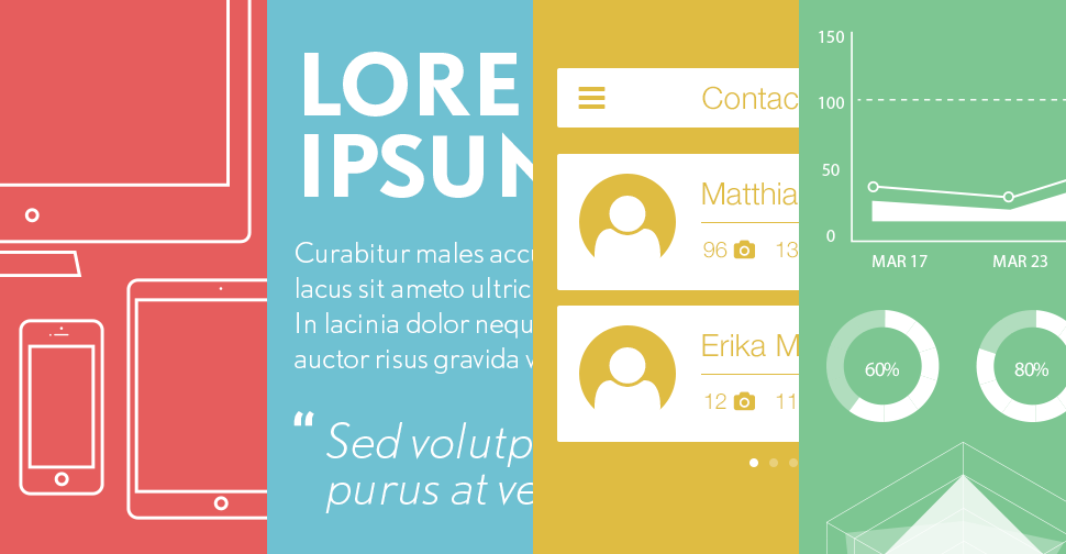
Responsive Interactive Infographics (aka Webgraphics)
In the world of digital publishing, infographics have been the rage for the past few years. However, with more and more users accessing content on their mobile devices, infographics need to evolve beyond a static image.
Enter the responsive interactive infographic (also known as webgraphics). Webgraphics take the principles that make infographics great (engaging illustrations, beautiful typography, fun and exciting layouts) but execute them using the development principles of responsive design. In doing so not only are you able to engage mobile users, but you’re also able to create an experience worthy of the web by adding interactive elements, animations and increasing SEO value.
Focus on Typography
When the tenants of flat design began to emerge, there was one trend that caught on and became wildly important — web typography. This trend, empowered by the 2012 release of CSS3, allowed for designers to use not just “web-safe” fonts (Arial, Verdana, Georgia, etc.) but fonts previously only available to print designers.
In the past year, as responsive design and flat design have became more prevalent, the surge in efforts to ensure the legibility of beautiful type across all platforms has become critically important. Sites like the Medium, Smashing Magazine, and The Daily Beast have designed (or in some cases redesigned) platforms that focus on these principles.
Long Pages, Shallow Websites
This particular trend has intrigued me as I’ve watched it develop over the last few years. In general it seems webpages are becoming longer and websites are becoming shallower (containing few pages). Obviously, this trend isn’t universal — sites like Wikipedia — with it’s ever expanding breadth of entries — or ecommerce related sites like Apple — who need individual product pages — don’t fall into this trend.
That being said, if you look at a random sampling of websites you’ll notice a growing number of them are either single-page long-scrolling experiences or shallow websites with long pages. There are a couple of reasons for this trend, but ultimately it boils down to the emergence of mobile. In the end, mobile users would rather scroll than click. Mobile menus — if they are a remediation of desktop menus — tend to be long and overly complicated. With responsive and mobile first design becoming the web’s main design solution, it only makes sense for us to cater to a site structure that is friendly to our mobile audience.
Bigger Images
Have you noticed? Images are getting bigger. Over the past two years more and more designers are using full screen images and larger body images in their designs. This trend shows up mostly in desktop designs. However, in the last year this trend is showing up more and more on mobile as well.
In terms of a responsive strategy, this trend is becoming more and more viable through different polyfills — code snippets that allow for different size images to load based on some factor (most often screen size). With polyfills, especially the long sought after picture element becoming more commonplace, you’ll be sure to see larger images showing up in more and more mobile designs.
Video Backgrounds
While video backgrounds are something we don’t see on mobile (because of technical restraints and bandwidth considerations), this rather new trend is crushing it in the world of desktop. Gorgeous and engaging video backgrounds add motion and personality to a layout. Spend time exploring beautifully executed examples such as Street Art Project by Google or Square Space. You can be sure to see more of these as we move into the future.
Add to Our List
Now it’s your turn. We gave you seven important interactive design trends that we see making a splash right now. Have you stumbled across a technique in design that will make waves?