Practice doesn’t make perfect. Perfect practice makes perfect.
My high school soccer coach would bark this at us anytime we did the right thing (soccer) but did it poorly (American soccer). The lesson holds true with your content design. Tweets with photos generate higher rates of engagement, but that’s only possible if your photos are ready for action.
The good news: Shutterstock can help by tracking exactly what’s trending in searches of its catalog of 50 million photos, vectors and videos. Shutterstock’s 2015 Creative Trend Report lets marketers in on the top global creative trends in visual aesthetic: Blurred Backgrounds, Linear and Unique Perspectives.
Blurred Backgrounds
Remember when blurred images carried a bad rap, always hiding something you couldn’t see on the local news? Today, thanks to the influence of Tumblr and Instagram, intentionally blurring a photograph can help highlight, not hide, your content. When used as a background, an artfully blurred photo can make text easier to read and bring specific design elements to life.
Famed leadership blogger Michael Hyatt accents most of his content with an attractive and shareable image. For this post’s leading image, he blurred the background, save for the baseball, and used a varsity font for the title. Not only did it add color to the blog, the image was repurposed for Twitter, where the story was shared over 2,000 times.
In another recent post, Hyatt uses a bokeh photo, a similarly fast-growing background choice. The photograph’s out-of-focus points of light create a storybook, three-dimensional illusion. For Lymari Miranda, promotions art manager at Pace, this is the grand appeal of blurred backgrounds. “The added layer doesn’t compete with the copy,” she says. “But it has enough visual interest to keep you engaged.”
Miranda adds another secret to the blurred background rise: It’s a great cheat to mask a less-than-perfect image.
This strategy works well for Fernando Maclen, a Los Angeles–based interactive designer, who fashioned his elegant profile site with a looping background video. The capture of Maclen tapping away at his laptop from various angles is rudimentary in nature. When blurred, however, the image effectively sells his work as tireless, clean, and modern.
According to Shutterstock, searches of “blur” on its site increased 144 percent over the last 12 months.
Linear
When the husband-and-wife team of Edward Boatman and Sofya Polyakov launched The Noun Project in 2010, the goal was as simple as the icons they cataloged. In an interview with 99u, Boatman explains that his architecture job required presentations, which required high-quality icons. He’d soon learn his icon marketplace born from this need would benefit more than just client-facing professionals. He received emails from teachers, who used the symbols in classrooms, and from parents of children with autism, who tend to be visual learners.
Icons represent a visual language, with few restrictions on who can consume, and share, the message. Brands with an international reach should be especially liberal with the use icons in Web design and social media. One such global brand, Square, uses iconography to tell clever, easily translated stories on Twitter.
According to Shutterstock, searches for “line icon” increased a whopping 921 percent in 2014. The aesthetic is fun and functional, says Britta Hazel, a senior associate art director at Pace. But it’s also versatile. She counts applications of design from logos and icons, to infographics and way-finding systems. A streamlined linear design across these different uses can bring harmony and balance to your brand.
Check out the consistent and simple linear design found in Serious Studio’s Web icons and its Instagram feed. Remember: Almost any concept can be “iconified.” Explore creative uses for icons beyond basic Web navigation and infographics.
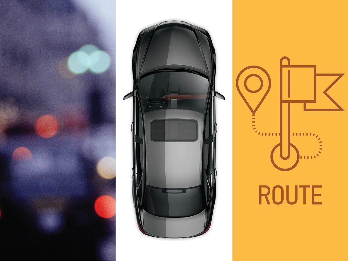
Unique Perspectives
This third creative trend accounts for inventive perspectives like “top view,” a search that increased 66 percent in the past year at Shutterstock. This perspective invites the viewer into a DIY creative space, within arm’s length of working materials, plated food, fashion accessories, architectural design, and, inevitably, more food.
For a master class in cross-channel synergy, dig into Chobani’s overhead food pics on Twitter. The link here takes you to a second Chobani social space, Pinterest, which then leads you to the recipe on the brand’s website. That’s three valuable touch points, each with a different mouth-watering photo of the dish.
American Express connects with its Instagram following by posting top-view images of fine dining, reading, and art, always with a credit card quietly in frame. The brand also shows off artist interpretations of its cards, and the “just finished” perspective makes for an intimate look behind the curtain.
Let’s circle back to Square for a look at top-view photography as part of Web design. Like many financial and software services, Square crafts unique messaging for various industries. On the homepage, visitors can select a business type in a tiled arrangement of clean, overhead settings and access their siloed content. I much prefer this handsome alternative to stock photos of strangers dressed as chefs and construction workers.

